


07 / ARTICLE
Designing UI and Motion as One Game System

Game UI and motion are often treated as separate production phases. Players experience them as one system. A clear interface tells them what is possible; motion confirms what just happened and what deserves attention next.
Begin with gameplay hierarchy
Primary actions, progress, status, and rewards need an obvious visual order. Motion cannot rescue an interface that makes the player search for the next step.
Animate feedback, not decoration
Useful motion communicates success, failure, selection, urgency, and transition. It should make the game easier to read while adding energy and personality.
Build reusable motion behaviors
Lightweight systems such as Rive can help interactive elements respond consistently without requiring a unique animation for every screen. Shared timing and easing make the product feel intentional.
Protect performance and clarity
Mobile motion must remain efficient. Short, focused feedback usually feels more responsive than elaborate animation that delays the player.
Practical takeaway
Map the moments when a player needs confirmation or direction. Design the UI and motion response together, then test them at real device scale and speed.
See the work behind the idea
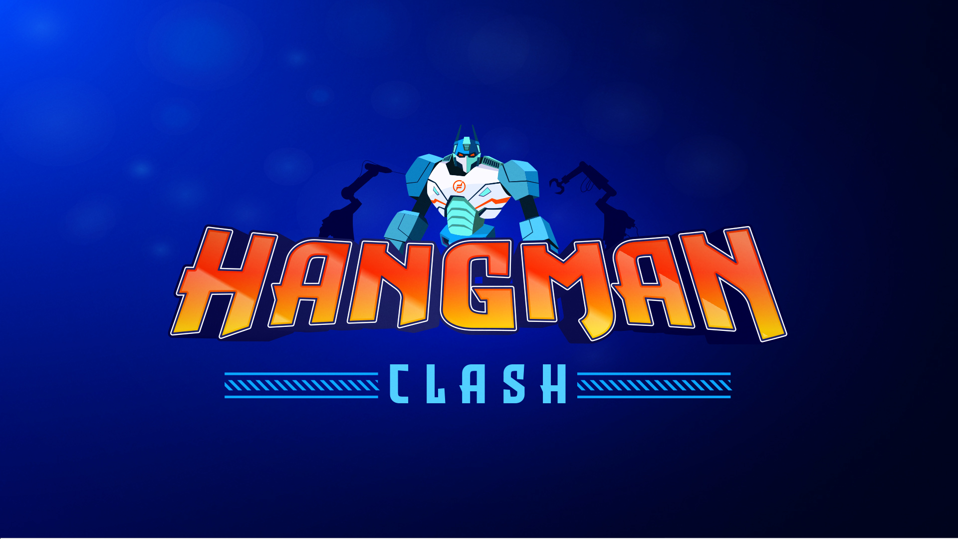
These lessons grew out of Hangman Clash, a mobile game brand and launch system. Explore how the game identity, interface, motion, website, and promotional assets came together in the complete case study.
View the Hangman Clash case study →
Launching a game, app, or interactive product? Explore web design, art direction, and animation and motion design services, or start a conversation about your project.